VISION
Let’s create a company that
we want the children around us to join!

In Japan, with aging society and declining birthrate, the children around us are precious treasures that support our communities and society. I believe that “Japan in the world,” “Hokuriku in Japan,” and “Toyama in Hokuriku” are wonderful and precious environments where children can grow up in a relaxed atmosphere in a magnificent natural setting while interacting with local people and working on academics, sports, and the arts.

I hope that each and every one of our employees will unanimously want their children, who grow up in this wonderful environment, to join the IAAZAJ Holdings Group. I believe that the people of the local community and our business partners around the world will feel the same way. Creating such a company is the cornerstone of my work.
To this end, I believe that each and every one of our employees, including myself, must be humble, always have a spirit of change (i.e., growth), and continue to strive to contribute. We will continue to take over and evolve what our predecessors have built, and with the guidance of our predecessors, we will enhance our presence in the textile industry with a bright future from the viewpoint of our business partners. We look forward to your continued support.
Continuous Integration CI

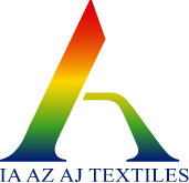
IAAZAJ Holdings Group’s CI(Corporate Identity) strategy is to concisely present the group’s corporate characteristics, philosophy, and action guidelines both internally and externally to ensure shared recognition of the group. We will introduce our company’s logo design, which represents the entire group, as part of our CI strategy.
Symbol Mark
The letter “A” common to all three group companies (IA of Daiichi Amimono, AZ and AJ of Art Joy) represents our aspiration to become the No. 1 company, with each company leading the way as an ace. The intermingling of straight and curved lines expresses “flexible creativity” and “supple strength,” while the expanding hem of the mark represents the desire to continue to be rooted in the community. The left side of the mark represents “growth,” which rises to the right, and the right side represents “trust,” which supports it. These two line consist the Chinese character “人 (person)” which is the most important thing in achieving growth and gaining trust.
Logotype
The sharp angles of the letters in the logo represent a speedy and sharp response to changes in the world, and the “TEXTILES” logo represents IAAZAJ Holdings as an aggregate of textiles. The final “S” protruding from the symbol mark expresses that, as an aggregate, we will step out of the current framework and move forward one step at a time.
Corporate Identity Color
As the philosophy of the IAAZAJ Holdings Group, which is involved in the field of color, we have chosen a gradation of the three primary colors as our corporate identity color. From the top, the colors represent the sun, greenery/nature, and water/sea, expressing the richness of life on the earth also in the flow of colors.

 TOP
TOP